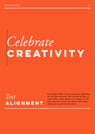
Autism Arthouse Brand Guidelines
Concept Development
The creation of brand guidelines for Autism Arthouse began with in-depth collaboration with the social enterprise staff to understand the organisation’s mission, values, and the visual and emotional tone they aim to convey. These discussions explored how the brand could authentically reflect the creativity and individuality of the people they support. A vital part of the process involved reviewing the artwork and projects created by those within the enterprise. This provided a rich source of inspiration, ensuring that the guidelines celebrate their unique talents while aligning with Autism Arthouse’s core ethos of empowerment and inclusivity.
Visual Identity
The resulting visual identity for Autism Arthouse combines vibrancy and professionalism, grounded in a bold red, white, and black colour palette. This striking combination conveys confidence and energy while maintaining a sense of balance and accessibility. Typography plays a key role, with Arthouse Sans, a custom-designed font, bringing a playful and contemporary edge, complemented by the timeless elegance of Garamond Pro for body text. Playful graphic elements, such as brushstrokes, textures, and abstract forms, reflect the artistic spirit of the enterprise. This identity ensures flexibility, allowing Autism Arthouse to maintain a professional yet authentic presence across all platforms, with content that resonates with both their artists and audiences.


